Re-branding a trusted Email platform
After a few years building up success with little Otto - The
friendly octupus - on the side, EmailOctopus decided to push their
growth even more, by giving him and their brand a full makeover.
Having worked with them before for a refreshment of their lading
page, in Vector we had the oportunity to work with them again.
This project was done remotely from start to finish. Brand,
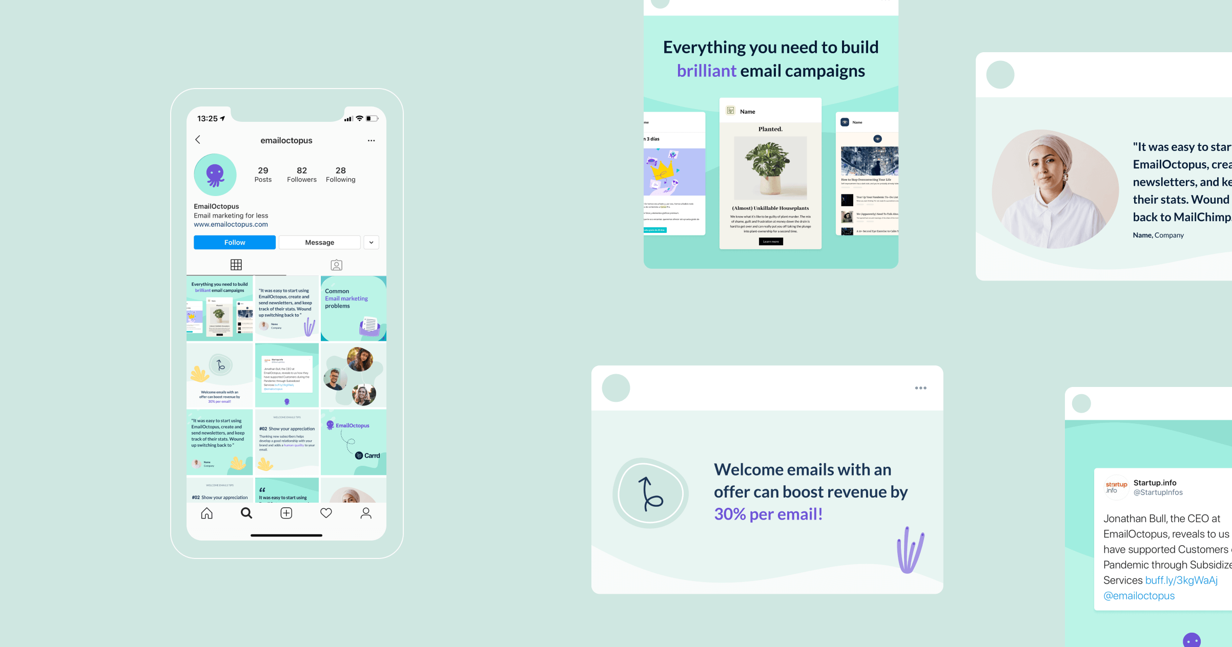
Marketing website and Social media presence where re-designed.
Branding - UX/UI Design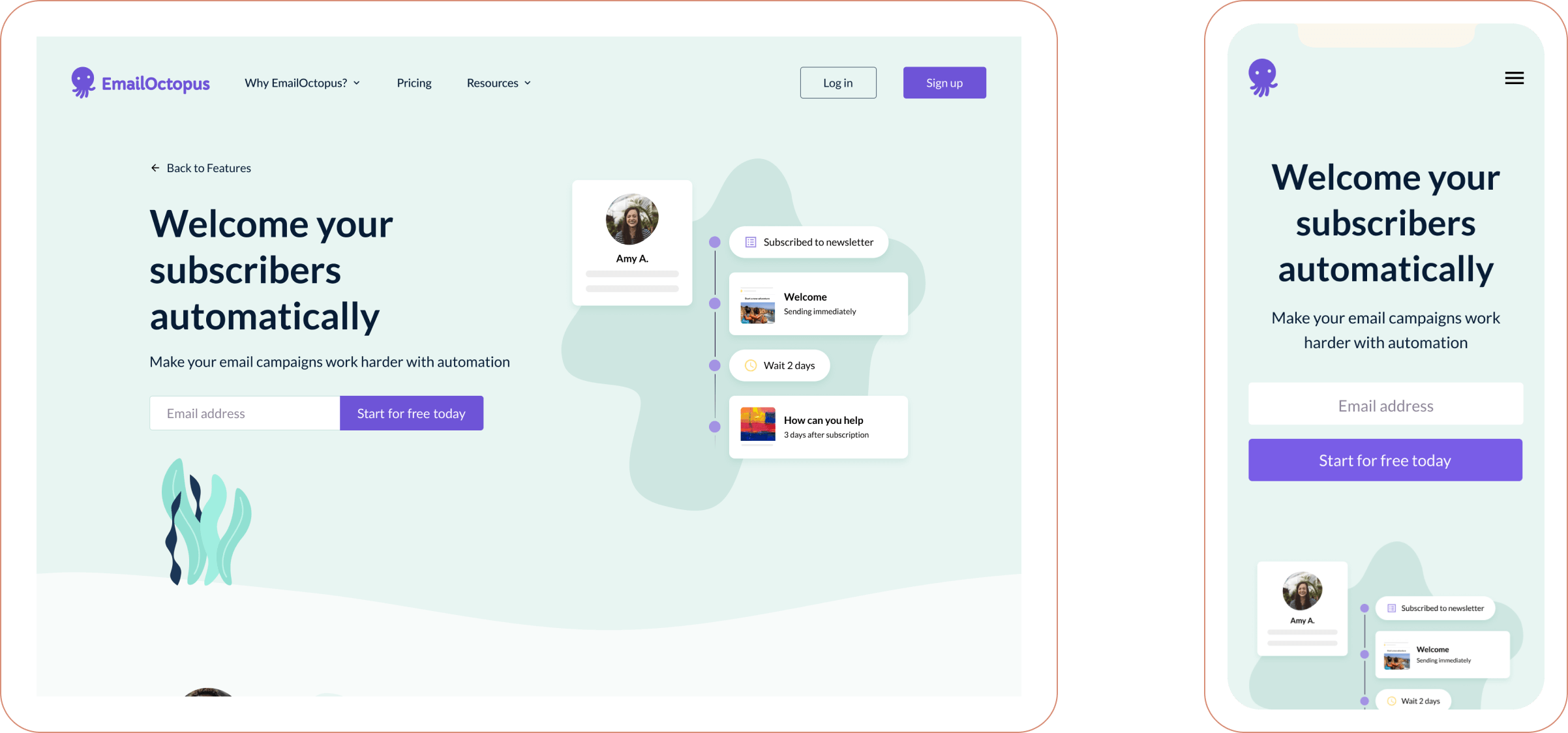
Brand
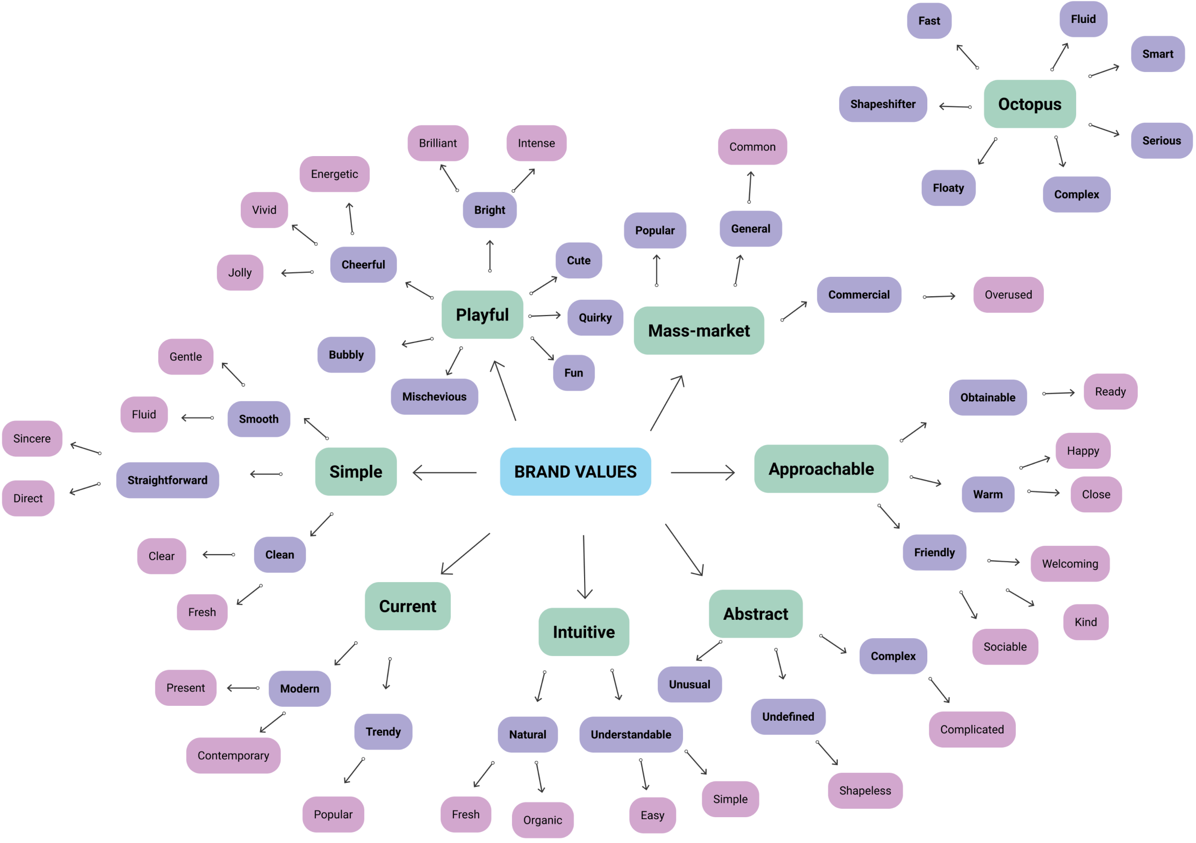
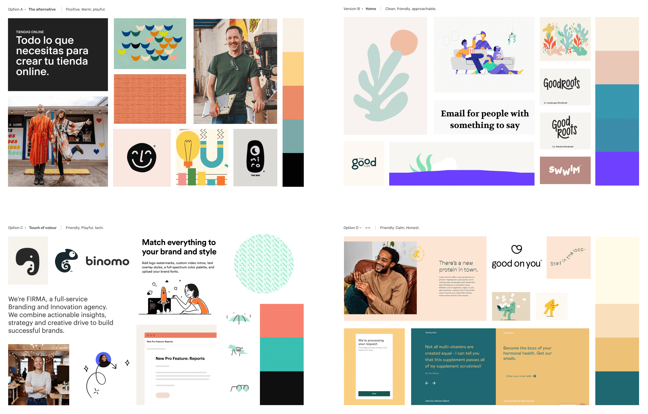
We started this phase by developing a group of moodboards to define
an initial look and feel for the brand. From this we started to
sketch the new look for the little Otto, and explore colours and
graphic elements.
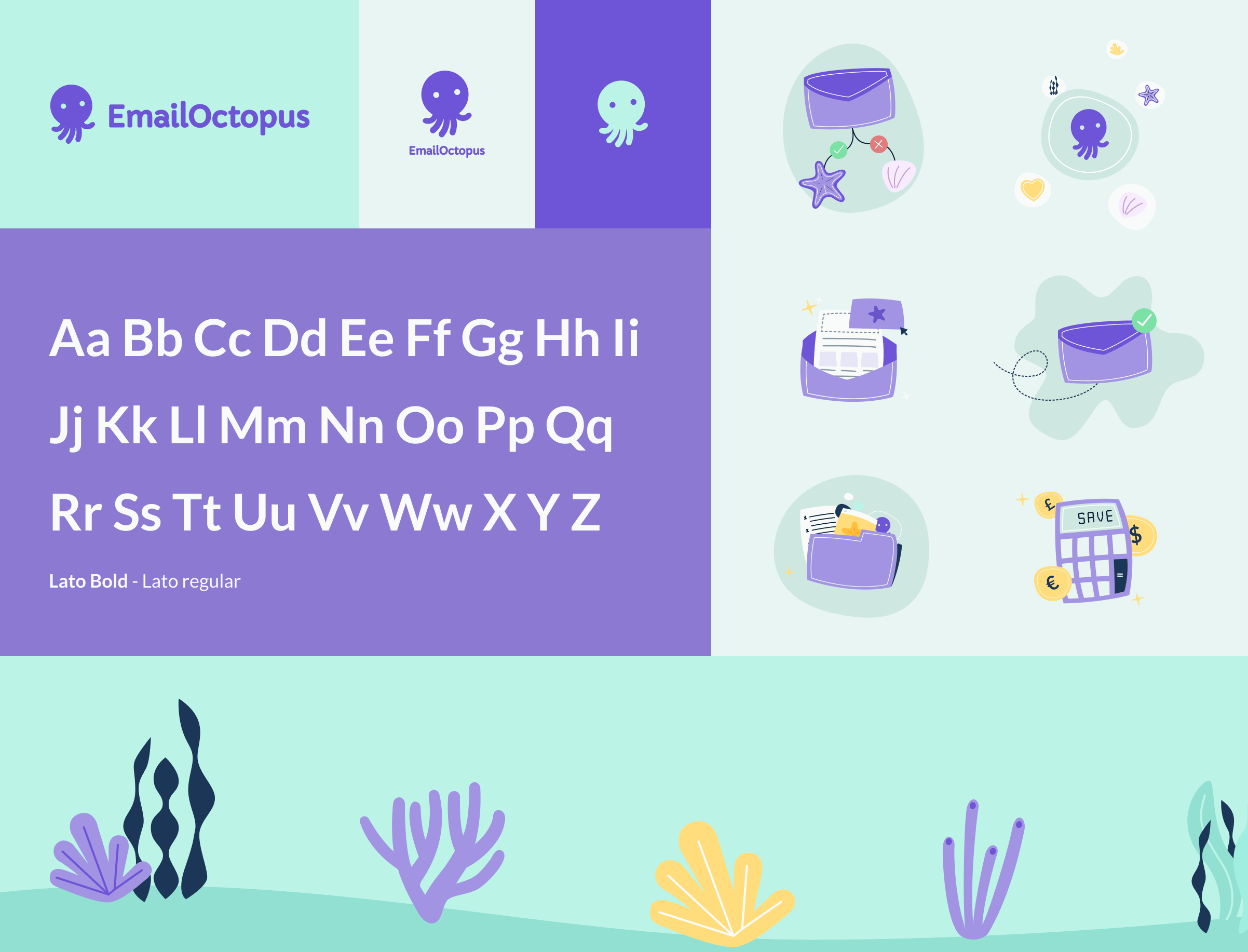
Brand wise, we agreed with the client an “Close to home” approach
insted of a complete change, keept their sea theme and created the
new visual language around it.
The colour pallete was refreshed to a brigther one and a group of
illustrations were created to be applied across all the different
channels.
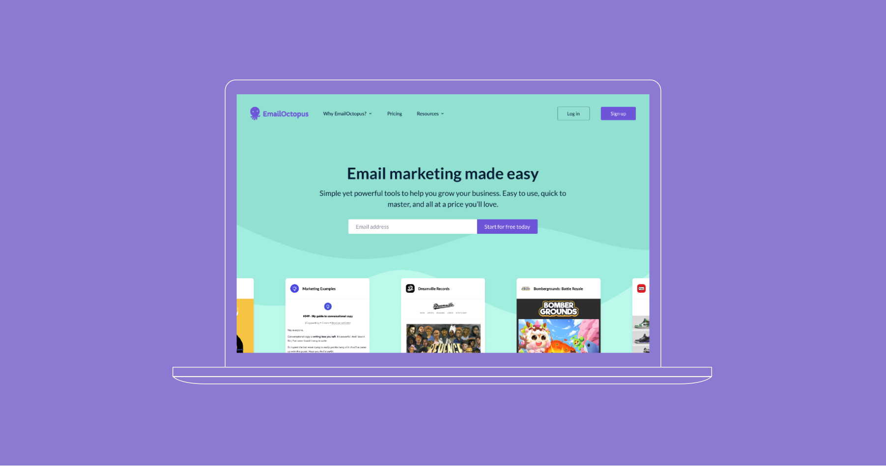
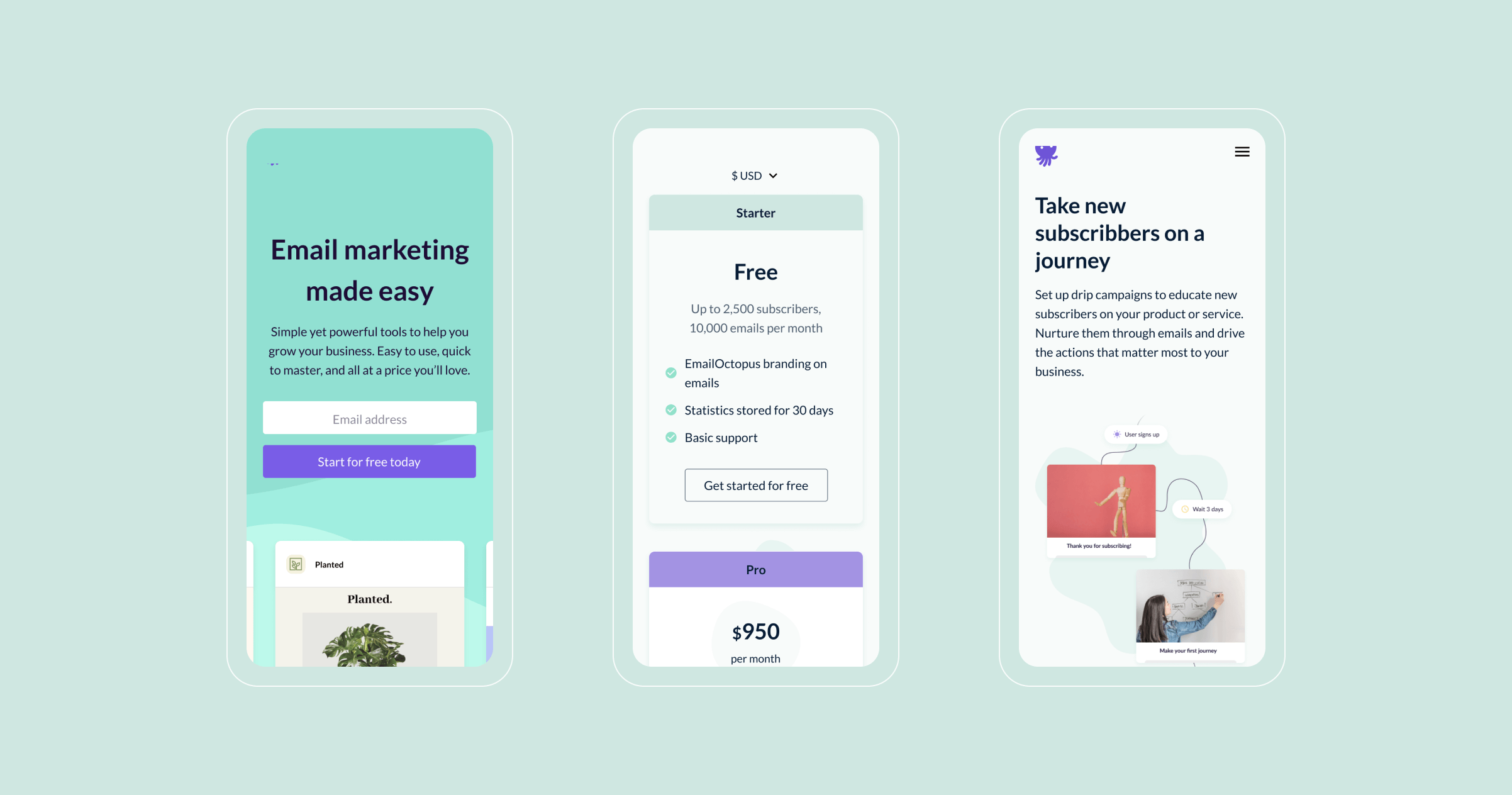
Website
Once the basic brand elements were defined we started to generate
wireframes and create components that were used as templates all
over the website. To balance the graphic’s quirky style, we used a
simple left and right layout to display text and graphic elements.
Brand wise, we agreed with the client an “Close to home” approach
insted of a complete change, keept their sea theme and created the
new visual language around it.
The colour pallete was refreshed to a brigther one and a group of
illustrations were created to be applied across all the different
channels.
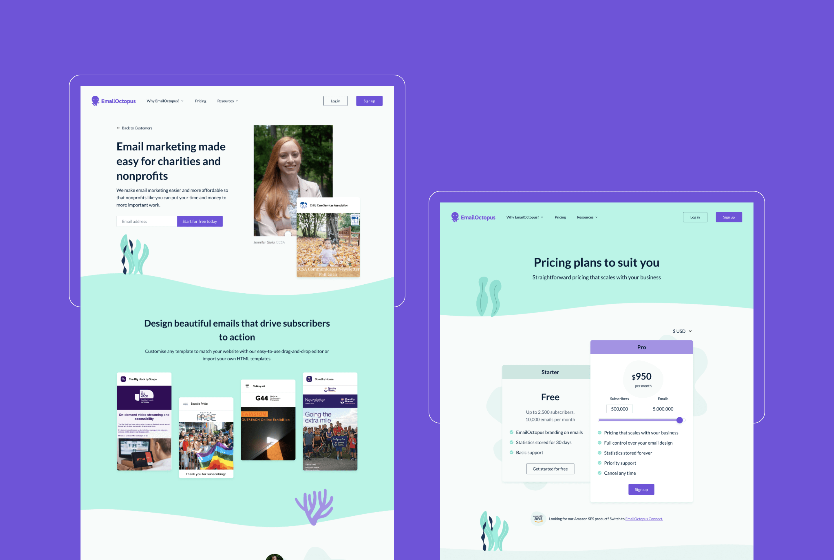
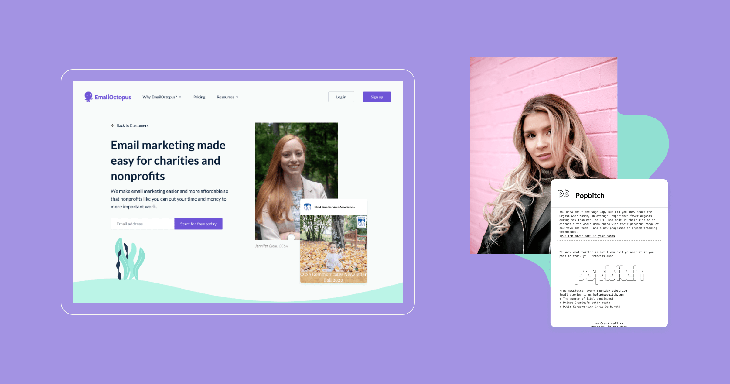
As mentioned previouly, one of the main objectives for the brand and
the website was to bring the client and their emails to the main
stage. We used real emails created by real clients across the website
and pushed their stories over the product features.