New brand for new beginnings
Vector is a London based Design agency specialized on SaaS products where I had the oportunity to work as a
UI/UX Designer for 3 years.
During these years we made small changes to the former site, but after a while we realized that Vector’s
brand was due to a redesign.
It wasn’t just a brand refreshment, Vector wanted to change, to grow and show its potential clients that
they are not just web designers, they are a now specialist SaaS design studio focussing on retention.
Branding - UX/UI Design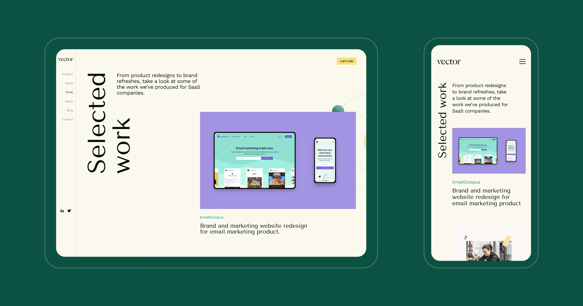
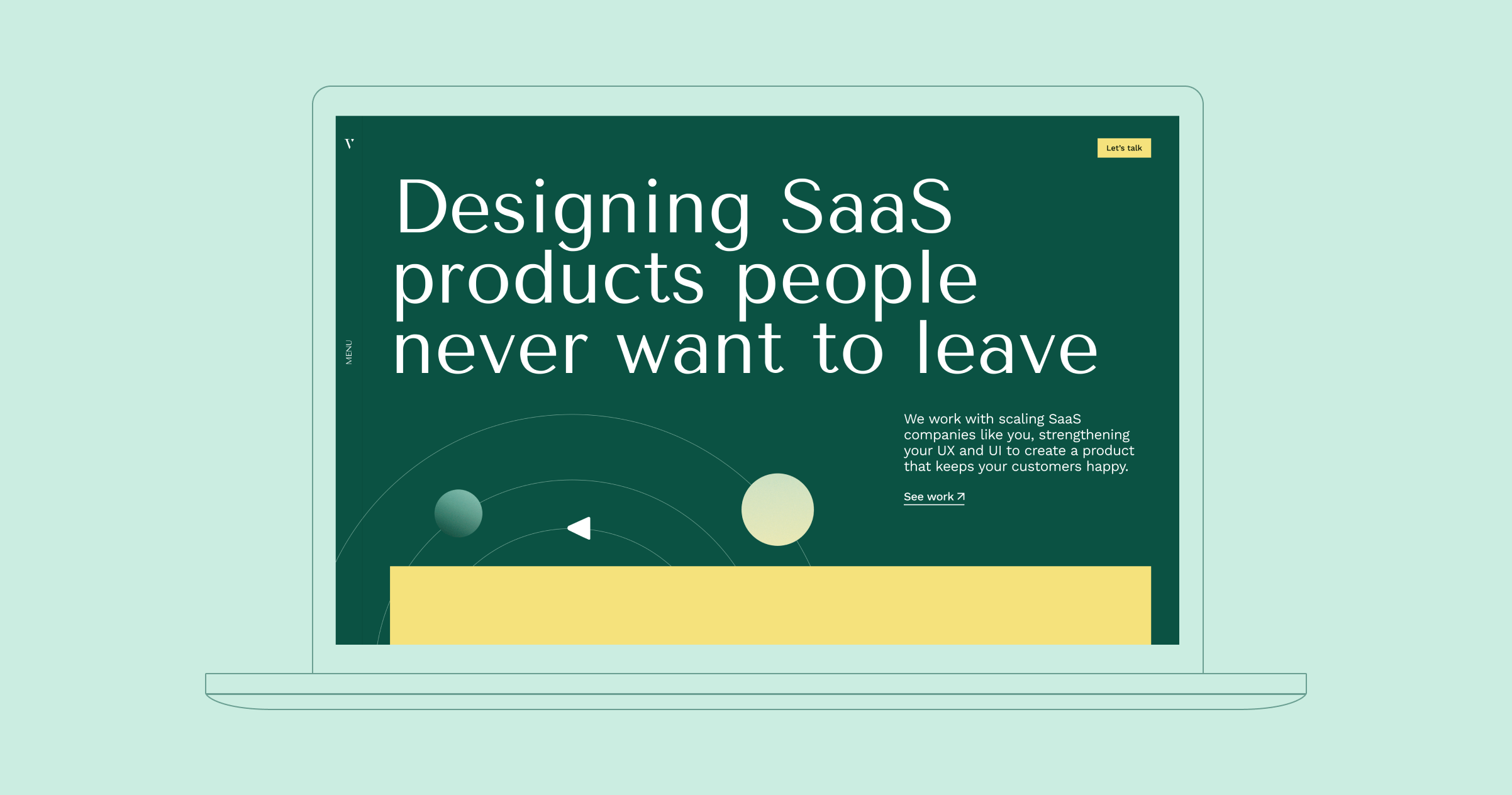
Brand
On the initial exploration I came up with 2 concepts for the visual language. The first one was thinking in
Vector as guides that would help your product to grow. The second one was more focused on retention and how
we wanted to help you (the client) to keep your users around you.
In terms of personality we juggle in between a quirky image or a more mature approach. A
quirky personality
was in-line with us internally, but a more mature look and feel felt like the right path to take if we
really wanted to grow and attract a broader target.
These three below where initial draft created to have an idea of the approach we wanted to take:
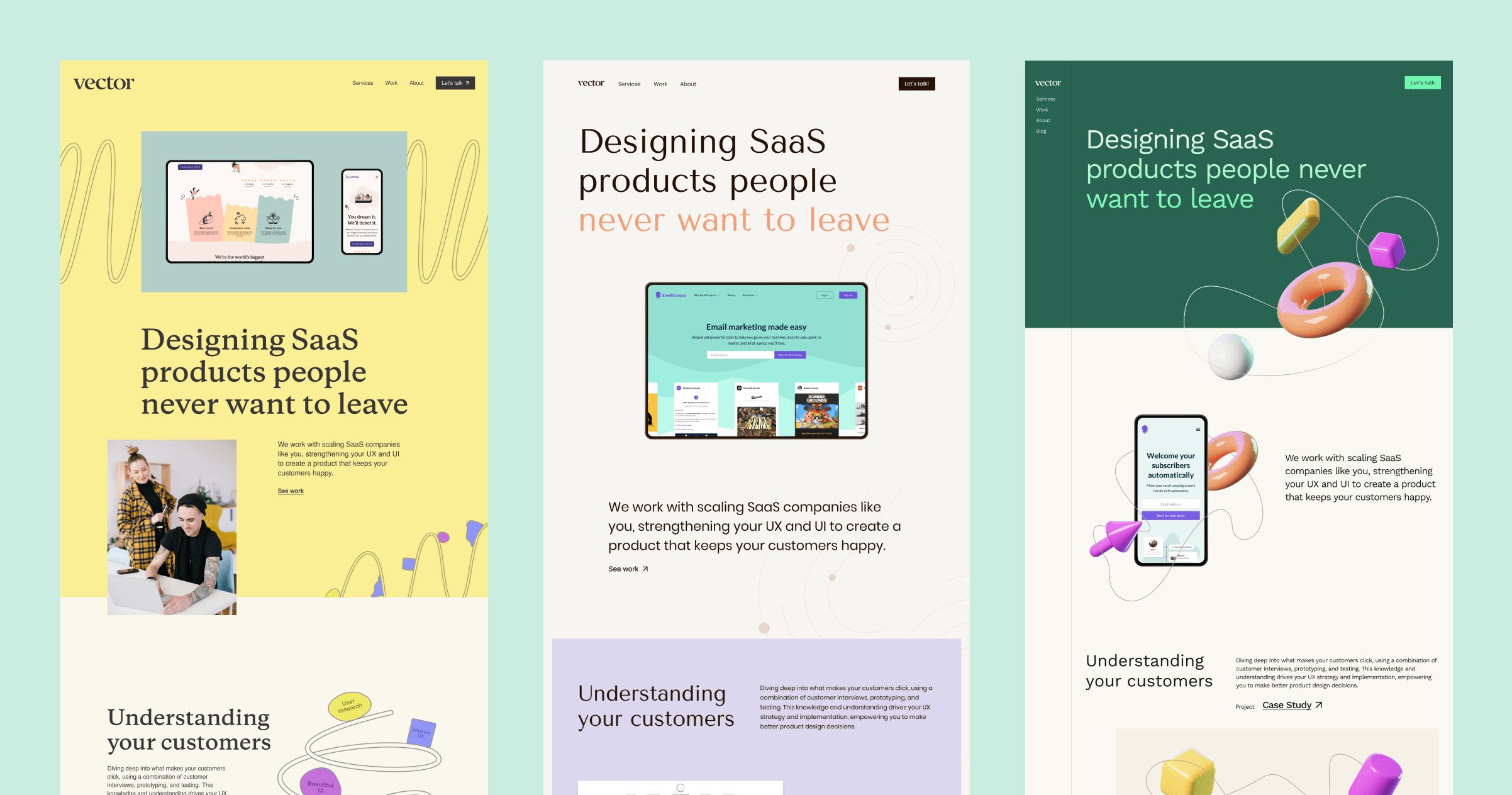
After a few back and forwards we decided that retention was more inline with the direction Treacle was
proposing and decided to represent this with “Orbits”, the client being the center and its users the
elements around it.
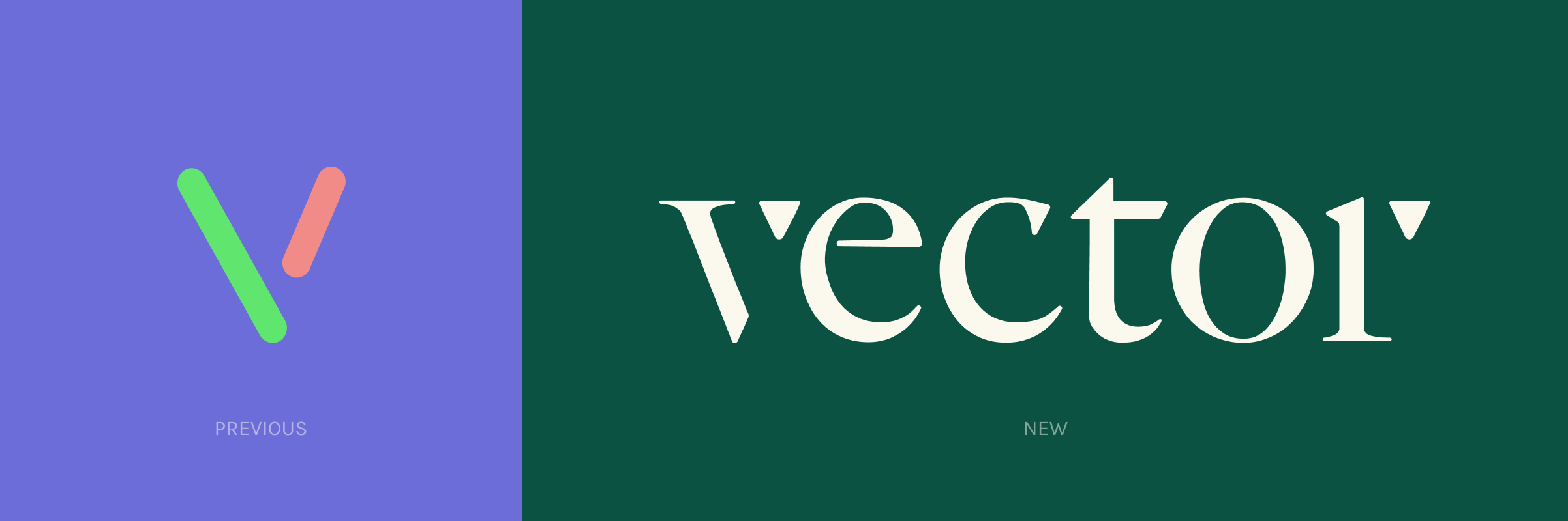
Along with the brand elements we also revamped the logo. We wanted something simple, with a little of
uniqueness that also displayed the company's full name.
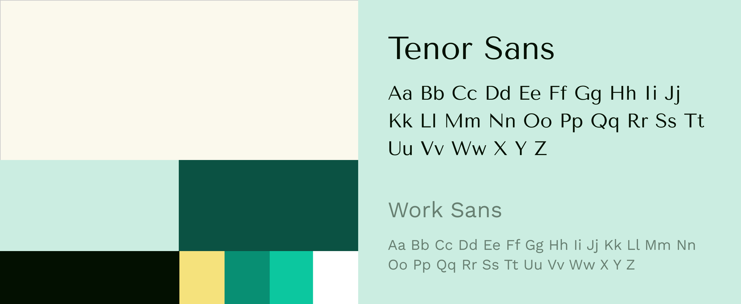
For colour I wanted to bring this idea of growth through the greens, introduce some warmth with yellow CTAs
and balance it out with a cream that would also help us to display projects with minimal colour clashes.
In terms of typography we wanted something stylish that combined with the vibe we were looking for. We
picked Tenor Sans with its moderness and Work Sans for a bit of contrast.
Website
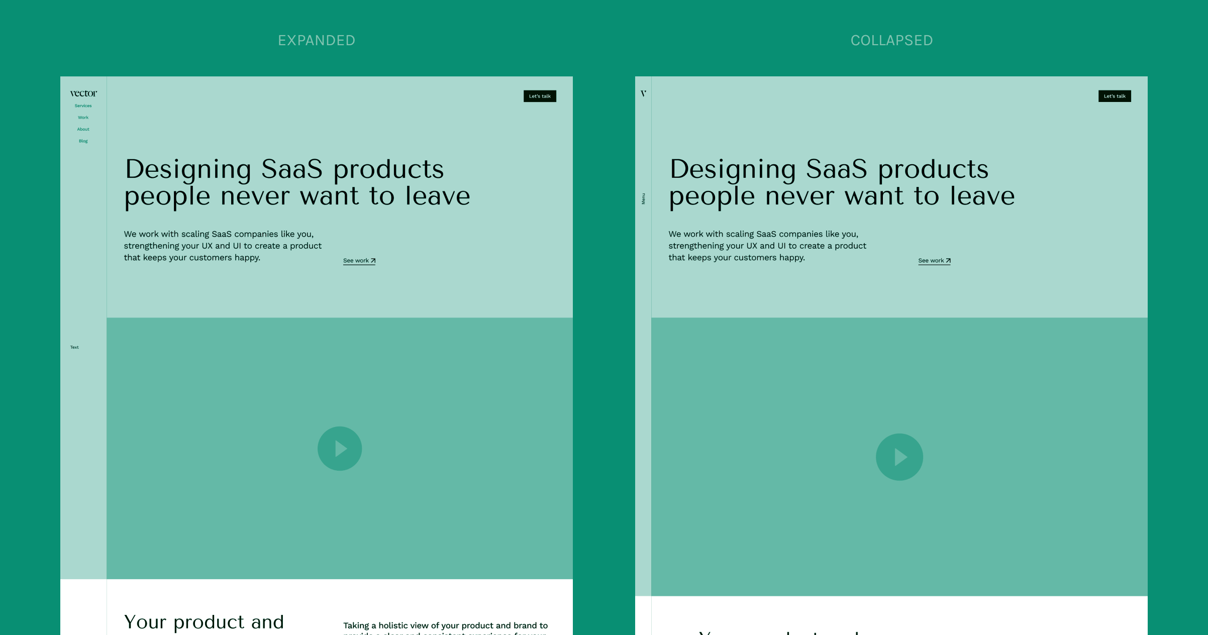
The website’s layout was designed alongside the brand elements. We wanted a layout that felt uncommon
without being hard to navigate.
For this reason I proposed a collapsable lateral navigation, it was uncommon compared with other agencies
we looked at but also has a familiarity with dashboards that are part of many Saas products.
Along with our skills in visual design we also wanted to show potential clients that we were able to create
solutions that required extra thinking on behaviours and interactions.
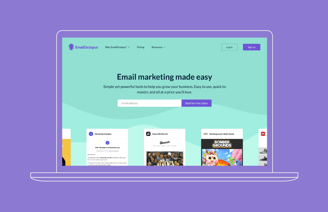
The case study pages where the most important pages to design. We wanted our case studies to have and impact
combining great imagery with animations.